ALEX P WHITE ON JOHN PORTMAN, SCI-FI AND SKOTE
Images courtesy of The Portman Archives and Alex P White
Alex P White is a designer based in New York and Los Angeles represented by Materia Agency.
Alex P White is an interior designer based in New York and Los Angeles. His provocative, unconventional style reveals a glimpse into his background in performance and fine arts. Besides projects for his clients —notables in the world of entertainment, fashion, and technology—, he has an outstanding Instagram account with extraordinary references. To contextualize his career and aesthetic, designer Alex P White had a conversation with the MATERIA editor about the origins of his references, influential childhood musings, his professional practice in interior design and art.
Enrique Giner de los Ríos: In your work there are constant references of previous times, yet I wouldn’t say that it is a nostalgic aesthetic. I see contemporary winks to decisions of interiors which one might think disappeared decades ago. Is it standard practice in your work to dig into visual references?
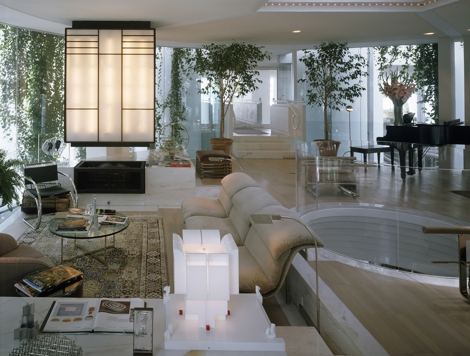
Alex P White: Definitely, I’d say the essence of my design process is about reference and context. I suppose I’m always looking backwards to see forwards and certainly start every project in my library, sorting through images. But you’re right, I’m not interested in appropriating some idealized past. I like how you describe it as a “wink”. That totally makes sense to me, my sensibility is such a camp aesthetic. To paraphrase something about camp I read long ago and from an unknown source; when artifice is sincerely exposed or expressed, it can have a perversely sophisticated appeal and that’s how I think about the references in my projects, like quotations. A chair is not a chair it’s a “chair”.
It’s about this thing I call “chooch”. It’s an energy or maybe something more like an ingredient, a spice that enhances flavor through tension. Something that’s a little bit off on it’s own but when used thoughtfully and judiciously it elevates. That’s what I’m usually looking for, a detail that has been forgotten or some stylistic choice no longer in fashion, or that might question some convention and seems worth reinvestigating. I’m also really into the symbolic potential of design. I like stories. I really need that narrative and the references become like guideposts in my decision making process. Design is a continuum and in the end, it’s the smartest combination of references that offer the most layered, exciting experiences.
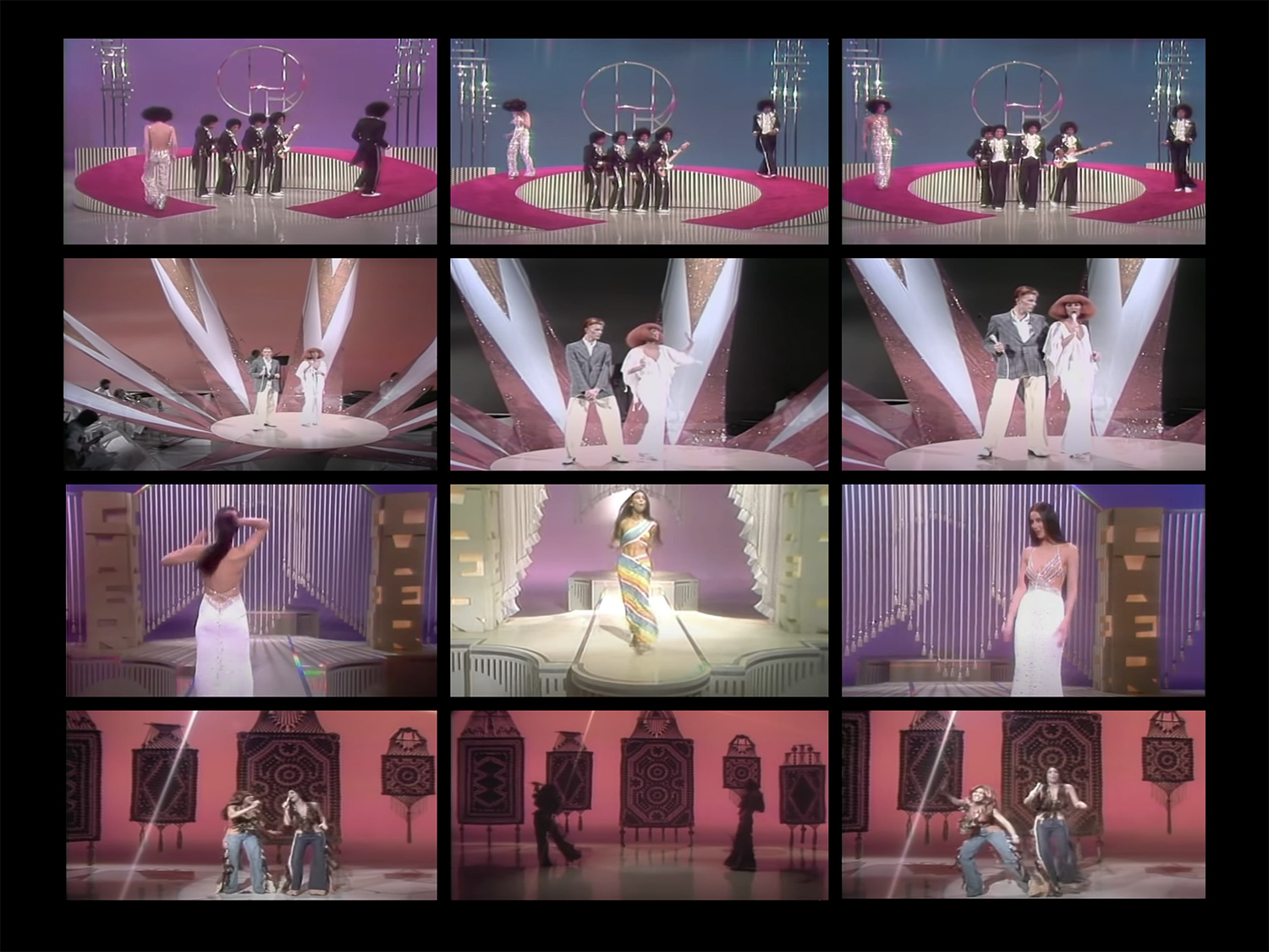
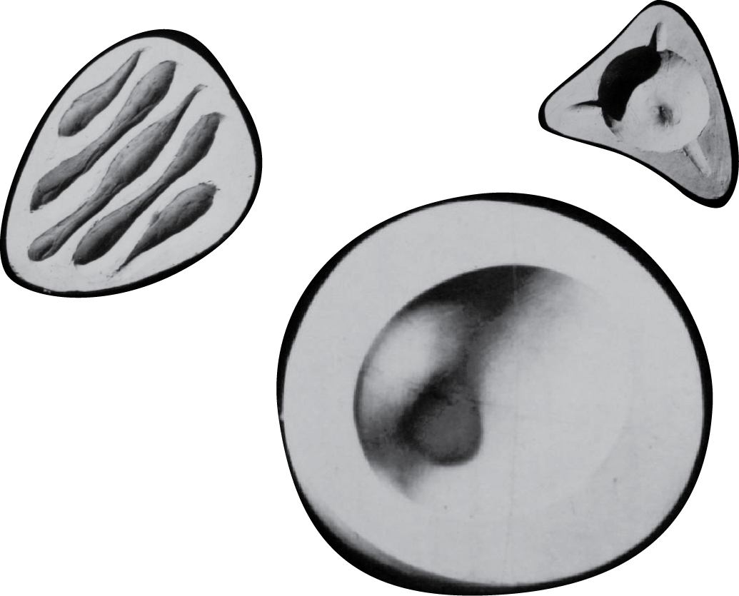
SCREEN GRABS BY ALEX P WHITE FEATURING THE CHER SHOW
EGR: Which would you say are your basic and most important influences?
APW: This is a tough one, there are so many at different stages but to be honest if we are talking about formative influences, I’d have to say the Den in my childhood home and Cable TV as banal as that might sound. I am literally LOL-ing as I write this to you but it’s true. It’s also about the specific time and place too, the late 70s and early 80s in Atlanta, Georgia. This might require a story to get the gist.
EGR: I don’t see why we can’t carry on with Atlanta and Cable TV. Do you ever regret any of these influences? Did you try to hide them? Did you deny them and then later allow them back in?
APW: Sure, for a brief time I rejected my past, there was some shame I had to deal with like most queer kids, but I learned to lean in and really embrace my experience and its influences on my aesthetic and my work. I grew up in a family that rarely expressed anything through design except in this one instance that really stands out. My Dad is an engineer and for a brief time when I was really young, he left his firm to freelance. He designed and built a den in our basement with an attached garage that became his studio and workshop as well as the family hangout. It had this handmade, sexy 70s vibe that is still so vivid in my mind’s eye. Everything was custom and built-in with wall to wall shag carpeting, a cork bar and my Dad’s homemade plywood speakers. I kid you not, they were stained with layers of dark brown shellac and finished with burlap speaker covers. I loved them. I’d go-go-dance on top of those speakers in leopard-print pajamas, listening to Ike and Tina Turner records, entertaining my parent’s friends. I was always dreaming of an adult life with my very own conversation pit and diagonal wood decor. I was never too interested in being a kid actually. As soon as I could read, I was rummaging through my Dad’s Playboy’s—not discreetly hidden, I might add—they were decor. It was the 70s and Playboy was like my internet. It was such an exciting time culturally and Playboy was hip to it all; the sexual revolution, art films, the Black Panthers, punk, the women’s movement and I was there for it. Most of my influences and preoccupations can be traced back to that time and that Den. I realized back then that spaces can be the embodiment of something emotional and symbolic and I never forgot that. I know this sounds esoteric but the energy of an environment and how it feels is almost as important to me as how it looks.
EGR: I’m curious about how cable TV is an influence on your design work. Can you elaborate?
APW: My introduction to “interior design” was mainly cinematic. I was totally enamoured with the set design of 70s variety TV shows. All those multi-leveled stages, motorized set pieces and extending ramps, the fake rocks and waterfalls, they were insane. I wanted to live on those sets from The Cher Show. Some of my earliest drawings were of performers in crazy costumes on TV sets.
Then we got Cable TV and my world exploded. All those choices; “adult” programming, weird sci-fi shows, late night arthouse films, and MTV. I mean music videos really exposed me to so much. I was totally into New Wave. So I should also include music and particularly the visual presentation that went along with the music as a major influence too.
But it’s the otherworldly, futuristic set design of movies like Logan’s Run & Space 1999 that really got me interested in design. Space 1999 was almost like a 70s design gallery with costumes designed by Rudi Gernreich and spaceships outfitted with classic Italian designers like Gae Aulenti, Vico Magistretti and Mario Bellini. It totally makes sense that I’m drawn to theatrical and overly stylized interiors, right!? I’m so grateful that my job is creating dream homes and spaces for my clients. I love those relationships, but I also really dig the fantasy of making images of my interiors too. That’s the part that feels like mine, that I get to keep and it goes all the way back to set design and cable TV.
JOHN PORTMAN, ATLANTA MARRIOTT MARQUIS © 1985 JAIME ARDILES-ACRE
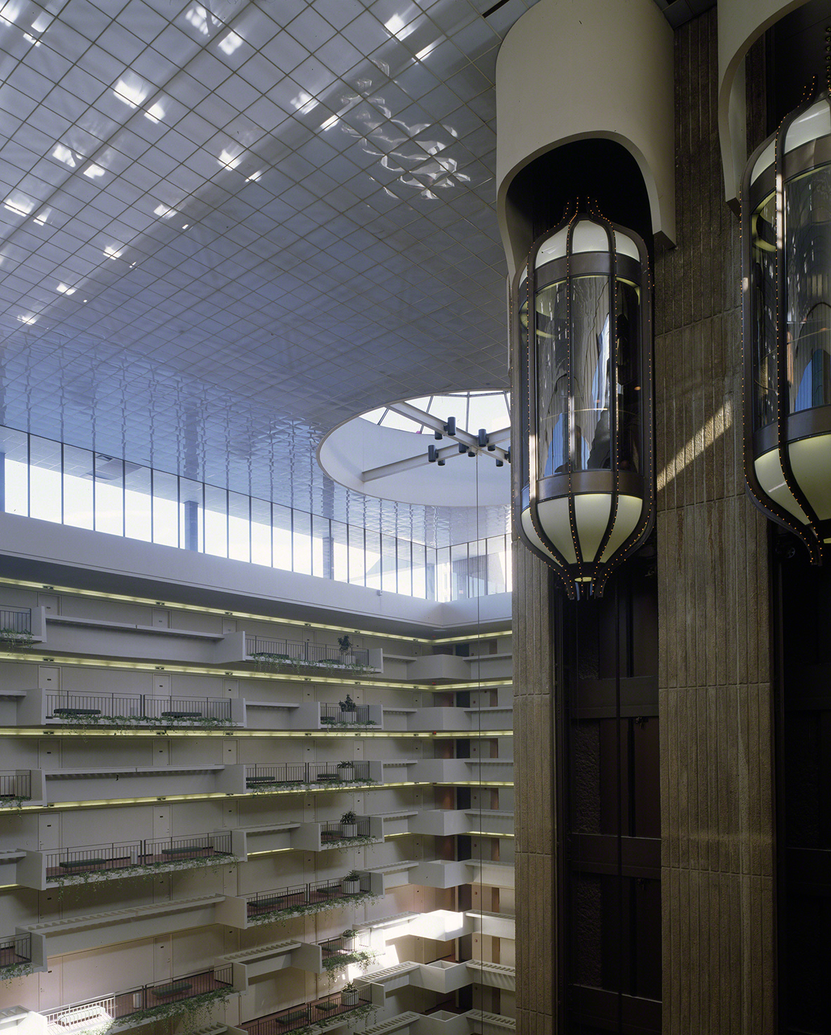
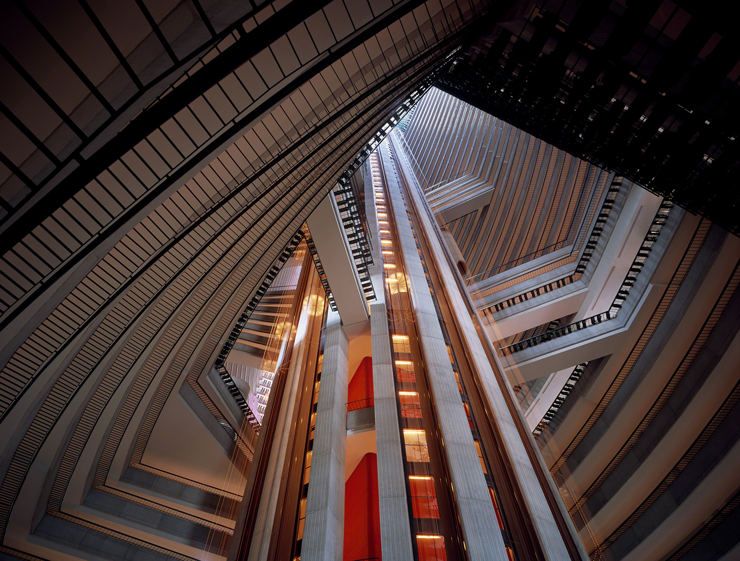
JOHN PORTMAN, HYATT REGENCY ATLANTA © 1989 MICHAEL PORTMAN
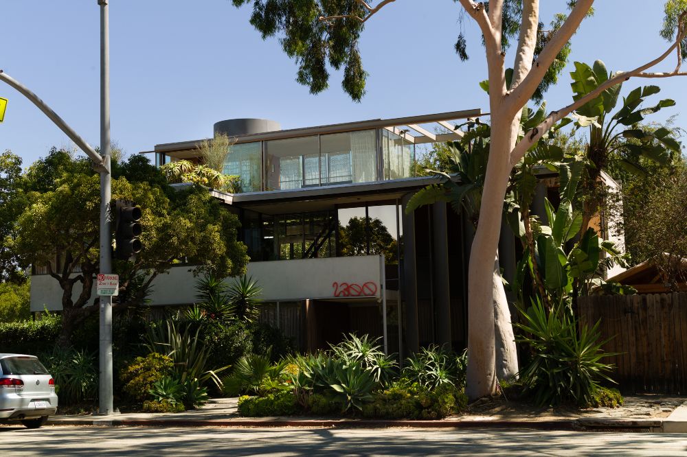
EGR: The Atlanta skyline has a bit of that 70s futuristic aesthetic. Isn’t the architect John Portman responsible for a good portion of it? Are you familiar with his work?
APW: Oh definitely! I have a pretty major crush on his work. I was so obsessed with the Atlanta skyline growing up, one of Portman’s most recognizable buildings, the Hyatt Regency has a blue dome, flying saucer-like shape floating on top, like it just landed there. It houses a revolving restaurant so of course I begged my parents to take me. It’s called the Polaris, oh, the glamor of it all. I’m still obsessed with Peachtree Center which is where the Hyatt is located. It’s a pretty wild urban development project that started in the 70s and was finally completed in the 90s. The project was hotly contested during its day. Actually, I heard some of the buildings are undergoing renovations, I hope it doesn’t get ruined. I don’t think a lot of contemporary developers know what to do with Portman’s atriums. There’s so much space that can’t easily be converted into more rent.
Anyway, the project was intended to revitalize the city by reimagining “downtown” as this giant enclosed mall. The concept is a realm of futuristic convention hotels with soaring atriums, shopping galleries and office buildings all linked by this insane network of enclosed pedestrian sky bridges. Seriously, once you enter Peachtree Center you can literally traverse blocks and blocks of the city, suspended high above or below street-level without ever leaving the interior space of the complex. There are indoor water features, hanging Babylon style gardens, revolving restaurants, and glass elevators. It was about as close as I could get to the set of Logan’s Run or Space 1999 and I couldn’t get enough. As a kid it was my amusement park, my spaceship and my first real experience visiting design that looked like the TV shows and the movies I loved.
A few years ago, my partner and I were in Atlanta for the holidays and for kicks, we stayed in the Peachtree Center for New Year’s Eve. We ended up at the Marriott Marquis and I was so blown away, all over again. The Marquis has the most gloriously organic of Portman’s atriums, so skeletal it almost feels like you’re inside an alien’s body. It’s disorienting in the most dramatic way. We walked over to the Hyatt using the glass sky bridges to have dinner at Polaris. As we sat there slowly revolving in the sky having Martinis and taking in the sprawling city below, I almost cried. It was a full circle moment. Portman’s mastery of staging viscerally emotional and cinematic, interior experiences has been in my mind for most of my life. His work feels like a part of me.
Fun Fact: The musician Zola Jesus named her 2010 album Stridulum after a 70’s Italian Sci-Fi movie largely filmed in and around the Peachtree Center. The film stars my childhood best friend’s cousin, Paige Connor. The American release from 1979 was called The Visitor – it’s a must see, also check out Sharky’s Machine starring Burt Reynolds. It’s also filmed around Peachtree Center.
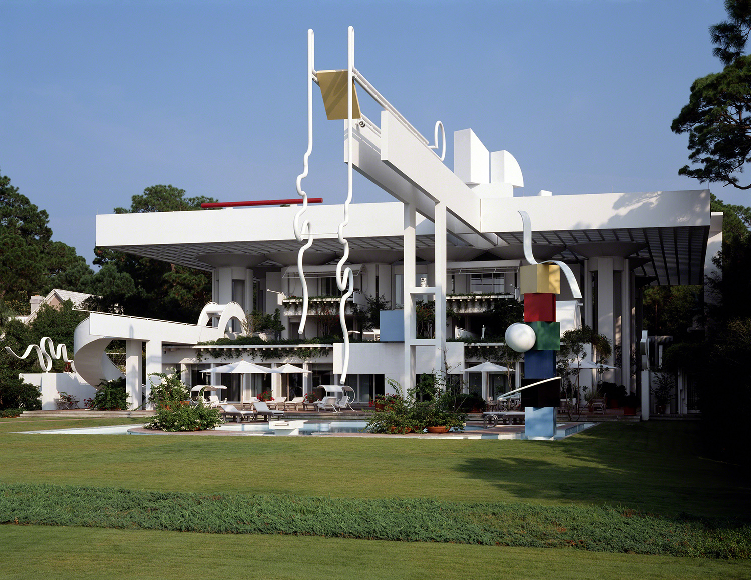
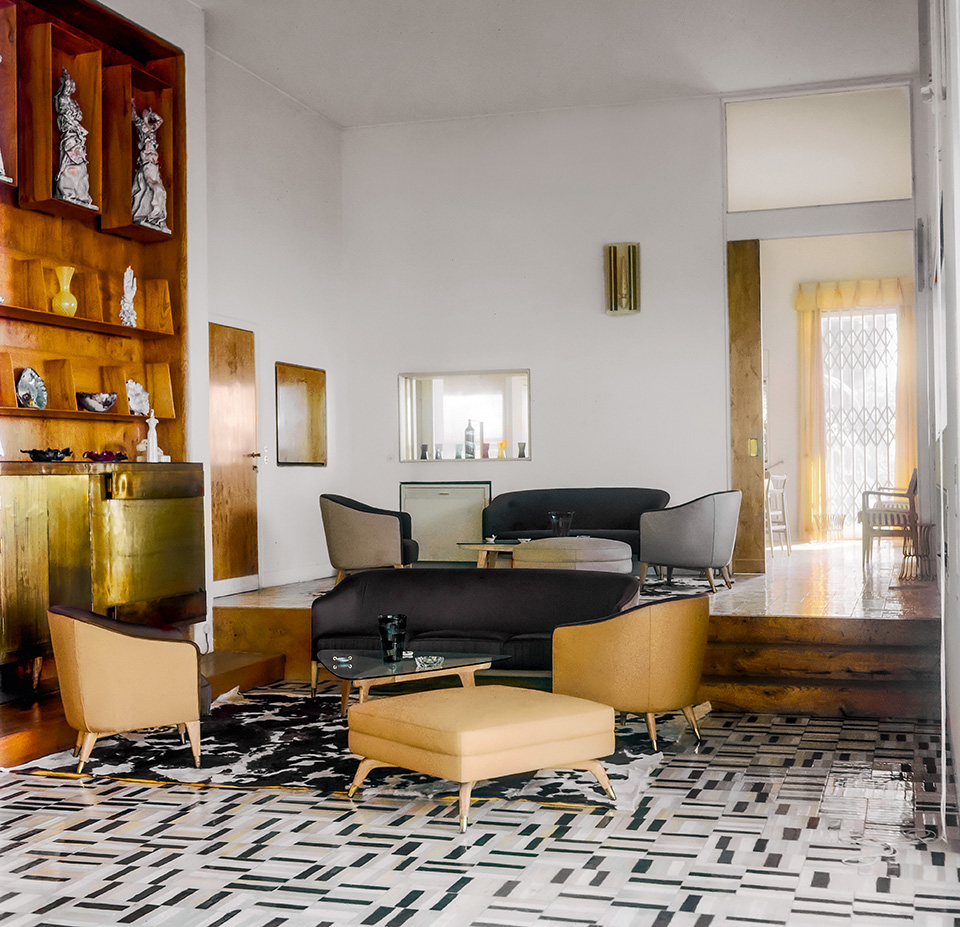
JOHN PORTMAN, ENTELECHY II © 1989 MICHAEL PORTMAN
JOHN PORTMAN ENTELECHY II © 1989 MICHAEL PORTMAN
EGR: I’m impressed by Entelechy II, his summer house. Its facade is extremely theatrical. Do you consider it to be a good turning point in his work? I don’t really see Sci-Fi there, rather an unleashed postmodernity.
APW: The entire house is an extremely theatrical experience in true Portman fashion, but I don’t see it as a turning point as much as an evolution. All his key ideas are still there, but I agree with you the architecture is more concerned with the abstraction of and combination of historical styles rather than the mod, futurism of his past work. Entelechy II would be considered full on PoMo for sure, but I might call it Fantasy Modernism, it’s just so emotional and evocative and really awesome. It’s like a museum chock full of his own artworks that he uses to extend architectural ideas sculpturally. I mean just WOW. Entelechy II is definitely his masterpiece in my opinion, his “Gesamtkunstwerk.” The thing that really blows my mind beyond the obvious amazingness is that umbrella roof! The gridded structure is supported by a series of exploded columns he uses to conceal staircase and breezeways. These connect a series of smaller pavilions contained under the organizing umbrella of the roof, some public spaces for guests and the rest are private for the family. Portman is a master of layering volumes in this way that seem to collapse structure and enclosure, form and space, interior and exterior until they embrace and become one. Entelechy II is definitely one of the greatest houses of all time.
EGR: You come from a Fine Arts background, whereas most people in your line of work come from architecture. Did you think that it is noticeable in your work? What are some of your art related projects?
APW: I hope any work I make is layered and emotional and resonates on some deeper levels but to answer your question honestly, I’m not totally sure how my design work translates artistically.
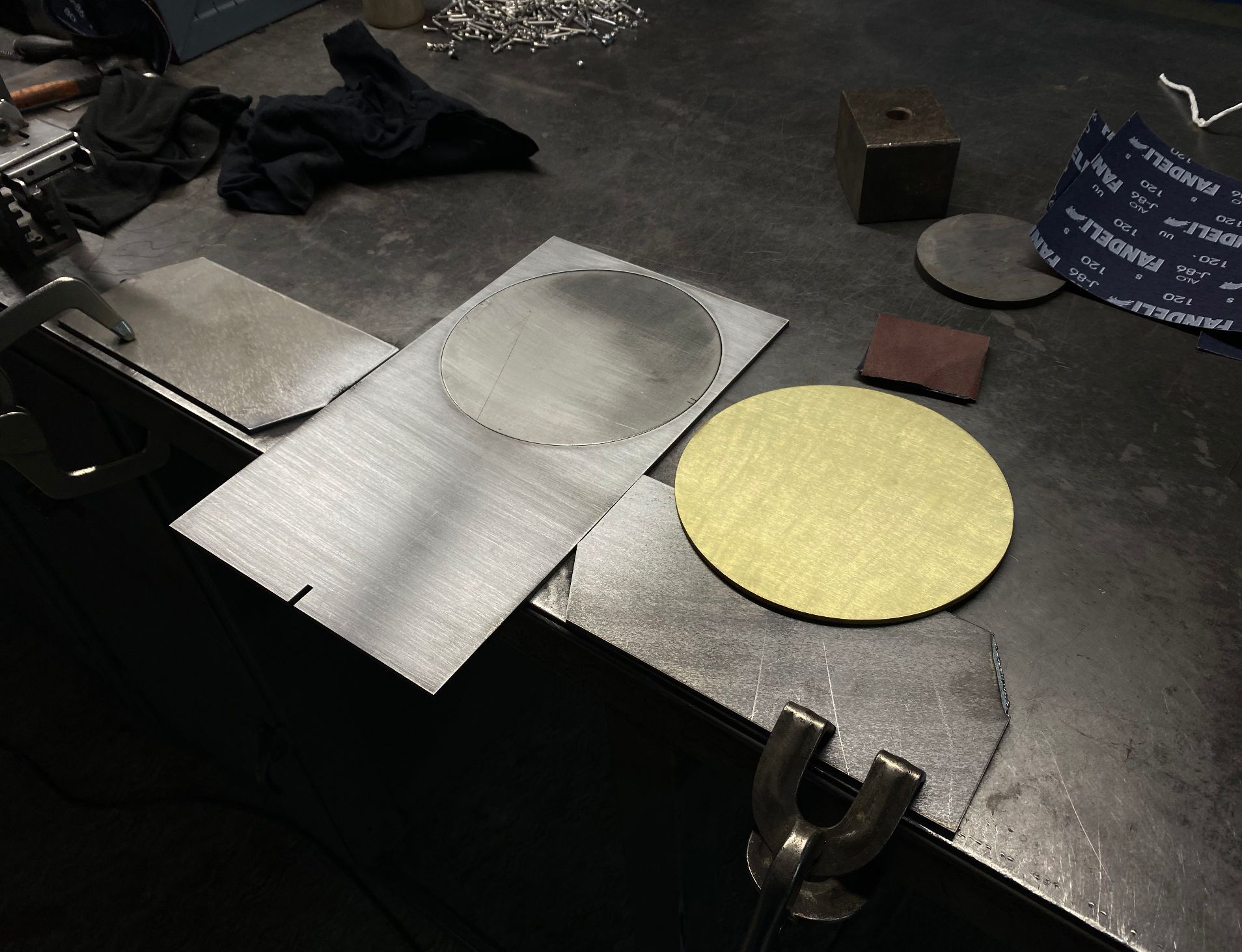
There was a time where I felt like I had to justify or defend the old art vs design questions. Before I started interior design professionally I was making installation art, public art, social participatory projects and performances with SKOTE. The subject of most of these projects was design related and viewed more through that lens than an art critique. Design just wasn’t taken as seriously as art, maybe architecture was but anything related to furniture design, set design, performance or any of the decorative arts was seen as lessor in the cultural production hierarchies than art proper. I don’t feel that’s true anymore, but I did have that dialogue quite a bit.
I had a real hard time with categories and labels growing up as a queer kid in general. I wanted everything to be fluid, but had no language for these ideas yet. I was super into Interview magazine and all things Warhol so anything I learned about art flowed from there. I discovered Duchamp and his ready-mades in high school and that pretty much set my course for art school. If anything could be art when recontextualized or reframed then that’s what I wanted to be a part of… to be clear, I was also pursuing architecture school too, but art school won out when I started visiting campuses and attending parties. LOL. I naively thought I’m going to be an artist because I can make everything I was interested in and call it art, including design, music and fashion.
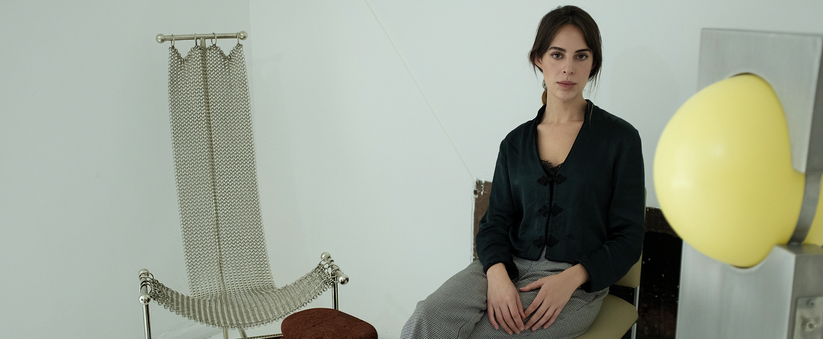
VIDEO COURTESY OF THE ARTIST. R AND COMPANY PRESENTS AFTER, 2012. VIDEO PERFORMANCE BY SKOTE. CONTEMPORARY FURNITURE DESIGN BY ALEX P WHITE AND KELLY BEHUN. MUSIC BY THE CREATURES, UNTIEDUNDONE. HATS BY VICTOR OSBOURNE.
EGR: Can you tell us something more about your SKOTE project?
APW: SKOTE is a really long term performance project (going on almost 20 years now) and it’s really near and dear to my heart. It was actually my Mom who coined the term skote. It was a noun and an adjective for her that described something undesirable and maybe even a little dangerous. Of course we adored anything my Mom called skote, for us it was like punk, something rebellious and contrary.
It was actually one of my oldest friends who brought the term skote to our friend group. Lancina the Goddess of Fun aka Secrets Le Secrets was one of my Mom’s favorite and best piano students. He truly appreciated her nuttiness more than anyone else. By the end of undergrad, skote became popular slang with my friends, but it had taken on the “so bad, it’s good” meaning or what we always called “s’wrong s’right”.
In the late 90s we all hung out and worked at this vegetarian restaurant in Atlanta called Homage. By day, it was a restaurant and at night it was a Bar/Music venue. It was actually my first interior design commission and I filled it with macrame, my shaggy 70s furniture collection, colored mood lighting and a wooden conversation pit that sort of resembled The Rolling Stones’ tongue meets hot tub. Essentially we were all club kids partying like it was 1999 sporting looks like it was 1979. It’s here where I met my collaborator, Ms. Jill Pangallo from NYC.
Jill and myself replaced the Club with MFA programs around the same time so we formalized things. Skote became SKOTE, our performance art project—mainly as a way to keep hanging out and playing dress up just more focused on content so the production and presentation could evolve.
Since then we’ve performed in museums, nightclubs, theaters, galleries, churches and public spaces, at summer camp, at art residencies and for the camera. We have staged site specific performances at storage facilities, in car interiors, dumps, abandoned condos and even Home Depot. We are always interested in the context of our performances so we film and edit improvisational performance footage together as a type of intervention and choreographic space for video. We even did a series once as an homage to the Radical Italians and staged video performances for some of my furniture design shows.
Our performances are silly and therapeutic as much as they are opportunities to extend reality and explore a critical engagement with both context and otherness. I sure hope we keep going another 30 years—the idea of slipping into a unitard for a performance sounds like the ideal octogenarian goal.
For further inquiries about Alex P White, contact The Len Co. an agency representing a new generation in design, culture, art, hospitality and architecture.